These are a collection of images from multiple projects where the use of a clean modern figurative solution was key. Clients here include financial, pharmaceutical and service based industries.
So with 2024 coming to an end the team at Watermark Creative decided to create a range of summer wrapping papers for our clients. Being that we celebration Christmas down under in the sun, a more summer themed solution was chosen. I tried to work with a range of visual cues that remind me of my Christmas memories as a kid. And as a wonderful surprise this illustration just received a merit award in the 3×3 Professional Show 22. Thanks 3×3 :)
These images were all created for medical clients and briefs.
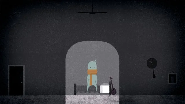
Moon Boy is a series of illustrations based around the story of a young boy and his bear who go on a journey to fix the moon which has been broken by an unusual event.
When described to me as an on-demand cleaning service, Nexdo sounded just like the kind of project I’d love to work on. Blake Enting and the team from Mister Wolf kindly asked me to bring to life the Nexdo brand for it’s launch in New Zealand and Australia. I worked on taking everyday cleaning tasks and adding the Nexdo factor. The result was a fun series of illustrations used for digital and online ads.
Designworks Auckland approached me to work on a new set of brand illustrations for Fonterra, New Zealand largest dairy producer. We used a diametric viewpoint with a clean colour and line approach. Each illustration represented a sector as well as being able to work into presentation charts.
Home was a set of treatment designs for a client who wanted some options of how a visual language could support different segments of their business. We worked with a limited colour palette and line detail. Being their business was set around realestate we felt people needed to bring warmth to the visual story. In this treatment the visual language was inspired from the original brand mark.
In this assignment I was commissioned to create a series of simple explainer comic styled graphics for Google. The task was bringing clarity and visual appeal to a range of complex concepts.
I love working in isometric. These images are from various projects with clients ranging from eco, construction, energy, and education.
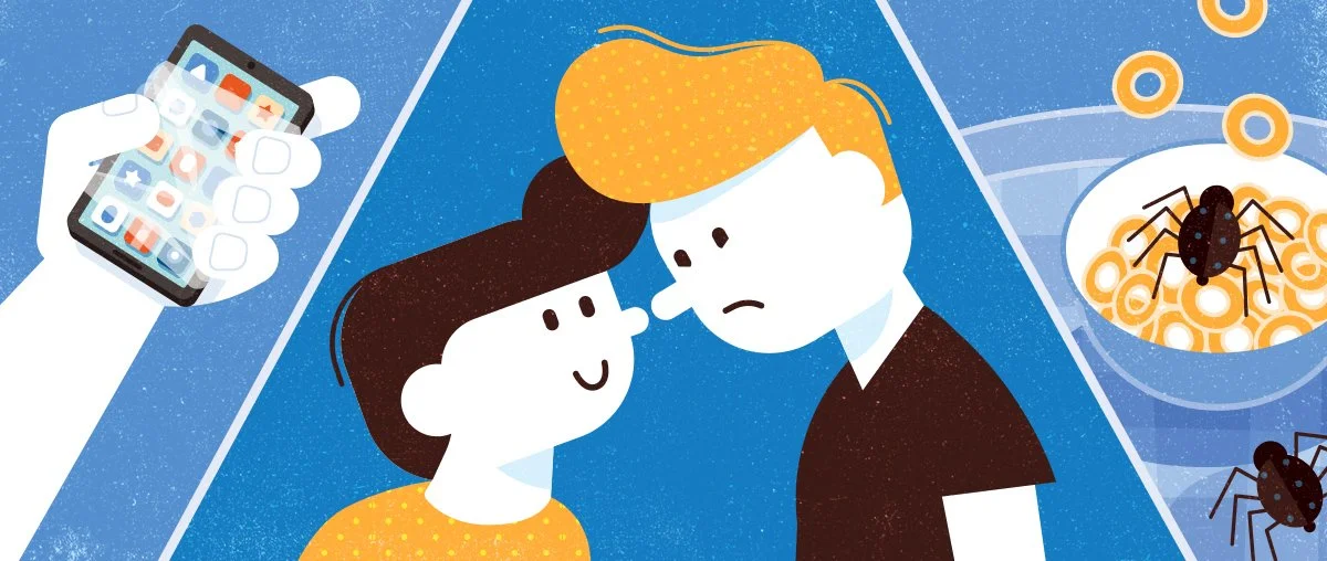
The following samples have been created for various clients such as Ikea, NZ Post, Fonterra, Tourism New Zealand, Tower Insurance, Pams, Mitre 10, investment firms and hotel chains. With all of these projects it was about creating a clear and consistent visual language.
I was given the opportunity to work with Arch MacDonnell from In-house on one of New Zealand’s iconic brands, NZ Post. In-house was evolving the brand and I was tasked with creating a visual language and toolbox of web icons and brand assets. NZ Post is all about people and their unique and individual personalities. Arch and I had the best time creating environmental scenes that captured moments within the NZ Post world. This was truely one of the most enjoyable projects I have ever worked on. Thanks Arch and NZ Post.
This project was for one of the big Australian banks, ANZ. I was asked to create simple a line and colour look for a series of windows representational of different people’s lives. This was a fun one. Wow look how much interest rates have dropped !
REACH is a support service that assists job seekers managing a health issue or disability to re-enter the workforce in New Zealand. I worked as the lead artist under the creative direction of Dave Way. I was involve in character development and the design of the scene art. I spent a lot of time creating a range of bespoke background base textures which the animation team used to add an over arching visual texture to the animation. The project won numerous awards including a Silver in the New Zealand Best Design Awards and Best in Show at the 3×3 illustration Awards in the US 2018.
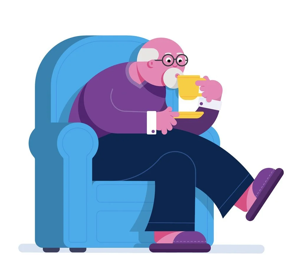
I love telling visual stories. Here is a collection of images I have created for various clients from corporate to government and in between.
So I need help with a packaging project Annette from Annette Roper Design said. Picture this, a group of crazy penguins with an even crazier production facility making ice cream cones! Oh yes, and did I mention they also have a delivery van? This was the start of a really fun job where I got to create this playful world for Annette and her client Snowdon. Such a fun job. The kids will be much happier this summer.
This collection of images are from multiple projects where a landscape was key.
When Brooke from Ward6 asked me to help her create a character for their Pharma client I was all in. Peter Pancreas was such a fun journey. Lots of expressive opportunities. Thanks Brooke and Ward 6 for letting me bring Peter to life.
So this was a fun one. Paige Sanderson from National Dental Care in Australia asked me to design a fun hero character. Next we paired our hero with other characters to create humours scenes around four themes.
Phil the whale was part of a series of online learning books I worked on for Savvas Learning. The story is set where our hero Phil learns to play with his smaller fish pals.
April fools was part of a series of online learning books I worked on for Savvas Learning. The story is set on April the 1st. April Fools day. Caleb is determined to play as many practical jokes on his brother Jake as he can. After a day of jokes and tricks a truce is called and the brothers are left laughing about their day of fun.
The strangest reptile house was part of a series of online learning books I worked on for Savvas Learning. The story is is about two kids Jan and Pete who go on a school trip to the Reptile House. Suddenly they find themselves alone and right next to a T Rex! A bit much for this school trip!
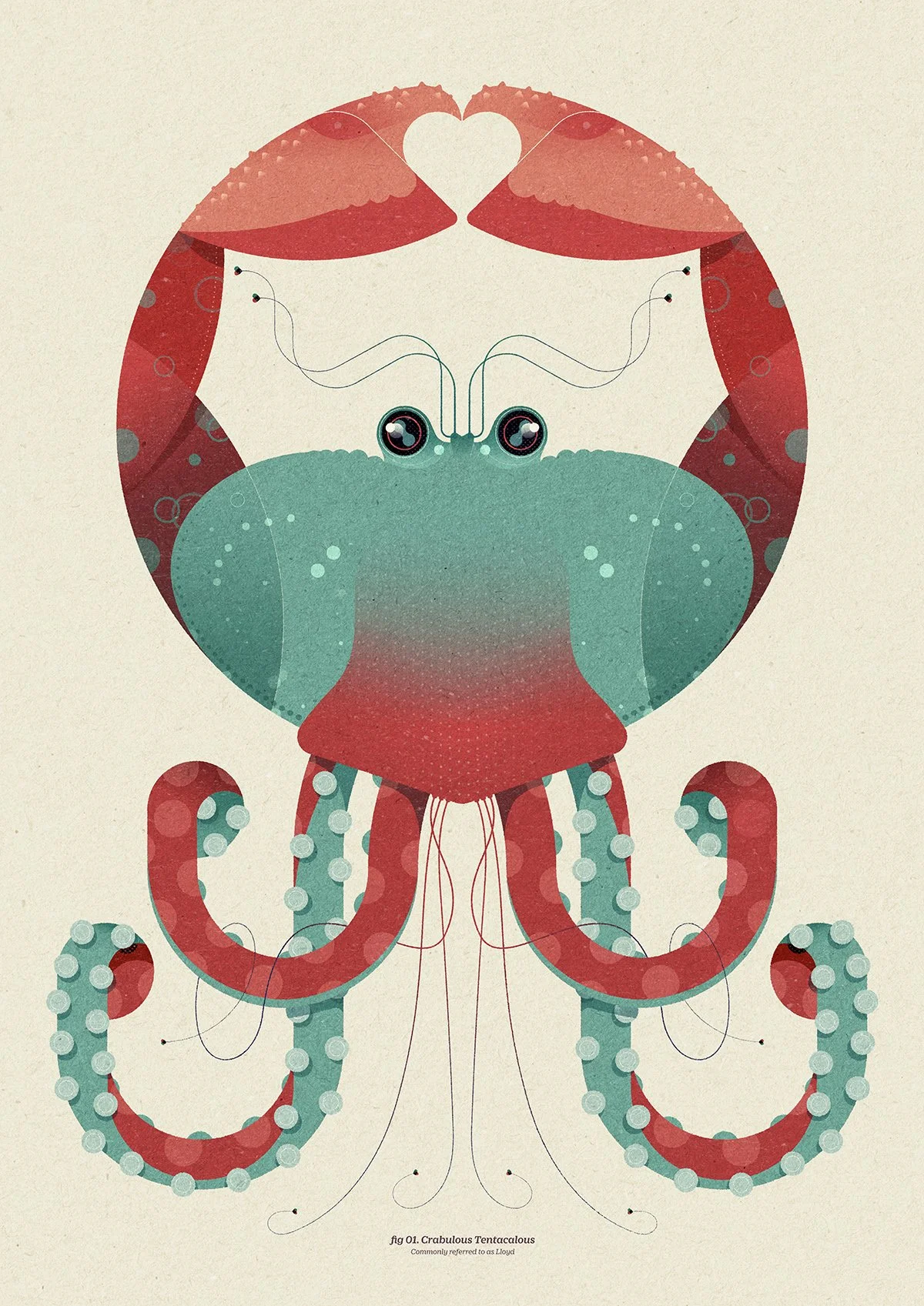
MONSTERS ARE IN MY BLOOD!
The crazier the better... there's no rhyme or reason as to who they are, or what they do, they're simply the result of the randomness of my brain. Don't try and understand them, they just crave one thing - LOVE.
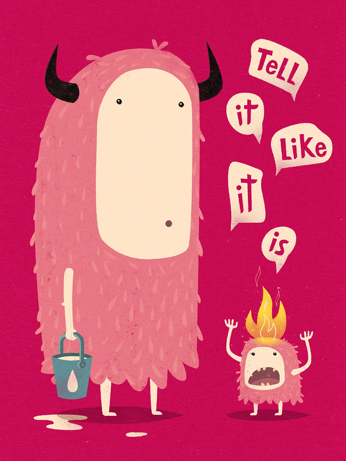
The Little Giant project was an art install project. We were approached by Aaron Turk from Colenso in Auckland New Zealand. All the images were based around the art of communication. My assignment, “ Tell it like it is “, was to create an image about the concept of communicating problems early so solutions can help bring about as little damage as possible. This was one of the fun ones :)
Titled “ Not From Here “ is the first in series I am working on in the creation of animals from another place . . Just where? Over the fence or from another land. Who knows.
The following is a series of spot illustrations I worked on for Savvas Learning. They were part of a larger set where we used a set colour palette and style. These illustrations were part this online learning program.
Noodle and Doodle was part of a series of online learning books I worked on for Savvas Learning. The story is set where Noodle a purple turtle goes to the planet Gobble to visit his friend Doodle a purple poodle.
I was commissioned by the team at Bettle & Associates to create an ongoing series of educational images for School Kits. Each image relates to a certain subject such as farming, energy, or education to name a few. Flash cards are also created from the art as part of the educational pack.
I have always had a love for building and construction. Having had the privilege of designing & building 2 homes I have seen just what goes into a journey like this. So when I was asked by Devoney at Coles and Co to create a range of diagrammatical illustrations for NZ Builders Academy I was thrilled. The task was to create a simple fun visual language for sometimes complex images. With the use of isometric, a set of line weight rules and a limited colour palette, we came up with this set of images.
The third book in the United Therapeutics Skivolo series this book follows a cheetah called Zara and her adventures after neuroblastoma treatment.
Carlos the cane toads exciting expitdition was part of a series of online learning books I worked on for Savvas Learning. The story is is about Carlos a cane toad. He lives in a puddle on the edge of the Amazon jungle. He wants to see the world so he hitches a ride on a ship to Australia. There he meets a snake, gets a pedicure and finds Australia his home.
The great gem race was part of a series of online learning books I worked on for Savvas Learning. The story is set in the city of Gemville. A group of animals take part in the Great Gem Race. The race takes Speedy Squirrel, Dashing Duck and Bounding Bunny on an exciting race to Gem Lodge. Who will win and take the title?
Gold was part of a series of online learning books I worked on for Savvas Learning. The story tells of the journey of grain to the dock where it is then taken by girls on the ship High Light to Tie Light Bay. The gals sail back to Play Day Bay. They then meet King Knight who shares his gold.
Way finding graphics are so important. Good design and simplicity are key. Many of these were created for educational clients.
When Creature approached Watermark Creative to work on a promotional video presentation using a suite of cool personalised characters we knew this was going to be fun. I worked to design the characters and scenes. I teamed up with Watermark’s 3D specialist Courtney Hopkinson who brought his magic bringing the designs to life in 3D. The final animation was art directed and brought together by Dave Way Watermark’s head of animation and interactive.
This was a lovely little project I was asked to work on with Tim Meredith at Boxer & Co in Sydney. The illustration was for a back of pack visual portrayal of We the many’s ethos and production processes.
One of my favourite projects during 2020 and lockdown was working with Phil Dunstan-Brown at Provenance on a series of shadow and reflection based conceptual illustrations for his client Askyourteam.
The second book in the United Therapeutics Skivolo series. In this book we follow Skivolo on his next adventures after antibody neuroblastoma treatment.
The Eventfinda project was one where I got to work directly with the client. The brief was to create a bird like branding character. Eventfinder are in the business of selling tickets and promoting events. They wanted a character with attitude who could be loud. From this I came up with the beak changing to a horn. Here is some of the visual pathway elements as well as some first thoughts from my sketchbook. Such a fun project.
Over the years I have worked on many character designs for branding, packaging to large scale animations. Here is a taste of some of the 2D characters I have designed.
I love packaging. The chance to have your work displayed in a 3D environment is always a fun challenge. In this project I created a range of soup favours for Coles supermarkets in Australia.
So Salt and Paprika is a colab relationship I have with the amazing 3D artist Courtney Hopkinson from Watermark Creative. I have know and worked with Courtney for over 25years. The selection of images are from client and self created projects.
Stanford University approached IllustrationOnline, my US agent, for me to create a range of geek birds and a magical tree. Dave Way from Watermark Creative animated a lovely wee narrative.
Literacy Aotearoa was a project that donated thousands of books into communities then encourage readers to leave the books where others could easily find them.